Tag Archives: Coding

Software tools for ABMs

A key consideration when embarking on an agent-based modelling focused project is ‘what are we going to write the model in?’. The investment of time and effort that goes into learning a new software tool or a language is so considerable that in the vast majority of cases it is the model that has to be adjusted to the modellers skills and knowledge rather than the the other way round.

Browsing through the OpenABM library it is clear that Netlogo is archaeology’s, social sciences and ecology first choice (51 results), with other platforms and languages trailing well behind (Java – 13 results, Repast – 5 results, Python – 5 results)*. But it comes without saying that there are more tools out there. A new paper published in Computer Science Review compares and contrasts 85 ABM platforms and tools.

It classifies each software package according to the easy of development (simple-moderate-hard) as well as its capabilities (light-weight to extreme-scale). It also sorts them according to their scope and possible subjects (purpose-specific, e.g., teaching, social science simulations, cloud computing, etc., or subject-specific, e.g., pedestrian simulation, political phenomena, artificial life) so that you have a handy list of software tools designed for different applications. This is, to the best of my knowledge, the first survey of this kind since this, equally useful but by now badly outdated, report from 2010.

Abar, Sameera, Georgios K. Theodoropoulos, Pierre Lemarinier, and Gregory M.P. O’Hare. 2017. “Agent Based Modelling and Simulation Tools: A Review of the State-of-Art Software.” Computer Science Review 24: 13–33. doi:10.1016/j.cosrev.2017.03.001.


* Note that the search terms might have influenced the numbers, e.g., if the simulation is concerned with pythons (the snakes) it would add to the count regardless of the language it was written in.

Image source: wikipedia.org

The Powers and Pitfalls of Power-Law Analyses

People love power-laws. In the 90s and early 2000s it seemed like they were found everywhere. Yet early power-law studies did not subject the data distributions to rigorous tests. This decreased the potential value of some of these studies. And since an influential study by Aaron Clauset of CU Boulder , Cosma Shalizi of Carnegie Mellon, and Mark Newman of the University of Michigan, researchers have become aware that not all distributions that look power-law like are actually power-laws.

But power-law analyses can be incredibly useful. In this post I show you first what a power-law is, second demonstrate an appropriate case-study to use these analyses in, and third walk you through how to use these analyses to understand distributions in your data.


What is a power-law?

A power-law describes a distribution of something—wealth, connections in a network, sizes of cities—that follow what is known as the law of preferential attachment. In power-laws there will be many of the smallest object, with increasingly fewer of the larger objects. However, the largest objects disproportionally get the highest quantities of stuff.

The world wide web follows a power-law. Many sites (like Simulating Complexity) get small amounts of traffic, but some sites (like Google, for example) get high amounts of traffic. Then, because they get more traffic, they attract even more visits to their sites. Cities also tend to follow power-law distributions, with many small towns, and few very large cities. But those large cities seem to keep getting larger. Austin, TX for example, has 157.2 new citizens per day, making this city the fastest growing city in the United States. People are attracted to it because people keep moving there, which perpetuates the growth. Theoretically there should be a limit, though maybe the limit will be turning our planet into a Texas-themed Coruscant.

This is in direct contrast to log-normal distributions. Log-normal distributions follow the law of proportional effect. This means that as something increases in size, it is predictably larger than what came before it. Larger things in log-normal distributions do not attract exponentially more things… they have a proportional amount of what came before. For example, experience and income should follow a log-normal distribution. As someone works in a job longer they should get promotions that reflect their experience. When we look at incomes of all people in a region we see that when incomes are more log-normally distributed these reflect greater equality, whereas when incomes are more power-law-like, inequality increases. Modern incomes seem to follow log-normality up to a point, after which they follow a power-law, showing that the richest attract that much more wealth, but under a certain threshold wealth is predictable.

If we analyze the distribution of modern incomes in a developing nation and see that they follow a power-law distribution, we will understand that there is a ‘rich get richer’ dynamic in that country, whereas if we see the incomes follow a log-normal distribution we would understand that that country had greater internal equality. We might want to know this to help influence policy.

When we analyze power-laws, however, we don’t want to just look at the graph that is created and say “Yeah, I think that looks like a power-law.” Early studies seemed to do just that. Thankfully Clauset et al. came up with rigorous methods to examine a distribution of data and see if it’s a power-law, or if it follows another distribution (such as log-normal). Below I show how to use these tools in R.


Power-law analyses and archaeology

So, if modern analyses of these distributions can tell us something about the equality (log-normal) or inequality (power-law) of a population, then these tools can be useful for examining the lifeways of past people. Questions we might be interested in asking are whether prehistoric cities also follow a power-law distribution, suggesting that the largest cities offered more social (and potentially economic) benefits similar to modern cities. Or we might want to understand whether societies in prehistory were more egalitarian or more hierarchical, thus looking at distributions of income and wealth (as archaeologists define them) to examine these. Power-law analyses of distributions of artifacts or settlement sizes would enable us to understand the development of inequality in the past.

Clifford Brown et al. talked about these very issues in their chapter Poor Mayapan from the book The Ancient Maya of Mexico edited by Braswell. While they don’t use the statistical tools I present below, they do present good arguments for why and when power-law versus other types of distributions would occur, and I would recommend tracking down this book and reading it if you’re interested in using power-law analyses in archaeology. Specifically they suggest that power-law distributions would not occur randomly, so there is intentionality behind those power-law-like distributions.

I recently used power-law and log-normal analyses to try to understand the development of hierarchy in the American Southwest. The results of this study will be published in 2017 in  American Antiquity.  Briefly, I wanted to look at multiple types of evidence, including ceremonial structures, settlements, and simulation data to understand the mechanisms that could have led to hierarchy and whether or not (and when) Ancestral Pueblo groups were more egalitarian or more hierarchical. Since I was comparing multiple different datasets, a method to quantitatively compare them was needed. Thus I turned to Clauset’s methods.

These had been updated by Gillespie in the R package poweRlaw.

Below I will go over the poweRlaw package with a built-in dataset, the Moby Dick words dataset. This dataset counts the frequency of different words. For example, there are many instances of the word “the” (19815, to be exact) but very few instances of other words, like “lamp” (34 occurrences) or “choice” (5 occurrences), or “exquisite” (1 occurrence). (Side note, I randomly guessed at each of these words, assuming each would have fewer occurrences. My friend Simon DeDeo tells me that ‘exquisite’ in this case is hapax legomenon, or a term that only has one recorded use. Thanks Simon.)  To see more go to http://roadtolarissa.com/whalewords/.

In my research I used other datasets that measured physical things (the size of roomblocks, kivas, and territories) so there’s a small mental leap for using a new dataset, but this should allow you to follow along.


The Tutorial

Open R.

Load the poweRlaw package

library(“poweRlaw”)

Add in the data

data(“moby”, package=”poweRlaw”)

This will load the data into your R session.

Side note:

If you are loading in your own data, you first load it in like you normally would, e.g.:

data <- read.csv(“data.csv”)

Then if you were subsetting your data you’d do something like this:

a <- subset(data, Temporal_Assignment !=’Pueblo III (A.D. 1140-1300)’)


Next you have to decide if your data is discrete or continuous. What do I mean by this?

Discrete data can only take on particular values. In the case of the Moby Dick dataset, since we are counting physical words, this data is discrete. You can have 1 occurrence of exquisite and 34 occurrences of lamp. You can’t have 34.79 occurrences of it—it either exists or it doesn’t.

Continuous data is something that doesn’t fit into simple entities, but whose measurement can exist on a long spectrum. Height, for example, is continuous. Even if we bin peoples’ heights into neat categories (e.g., 6 feet tall, or 1.83 meters) the person’s height probably has some tailing digit, so they aren’t exactly 6 feet, but maybe 6.000127 feet tall. If we are being precise in our measurements, that would be continuous data.

The data I used in my article on kiva, settlement, and territory sizes was continuous. This Moby Dick data is discrete.
The reason this matters is the poweRlaw package has two separate functions for continuous versus discrete data. These are:

conpl for continuous data, and

displ for discrete data

You can technically use either function and you won’t get an error from R, but the results will differ slightly, so it’s important to know which type of data you are using.

In the tutorial written here I will be using the displ function since the Moby dataset is discrete. Substitute in conpl for any continuous data.

So, to create the powerlaw object first we fit the displ to it. So,

pl_a <- displ$new(moby)

We then want to estimate the x-min value. Powerlaws are usually only power-law-like in their tails… the early part of the distribution is much more variable, so we find a minimum value below which we say “computer, just ignore that stuff.”

However, first I like to look at what the x_min values are, just to see that the code is working. So:

pl_a$getXmin()

Then we estimate and set the x-mins

So this is the code that does that:

est <- estimate_xmin(a)

We then update the power-law object with the new x-min value:

pl_a$setXmin(est)

We do a similar thing to estimate the exponent α of the power law. This function is pars, so:

Pl_a$getPars()

estimate_pars(pl_a)

Then we also want to know how likely our data fits a power law. For this we estimate a p-value (explained in Clauset et al). Here is the code to do that (and output those data):

booty <- bootstrap_p(pl_a)

This will take a little while, so sit back and drink a cup of coffee while R chunks for you.

Then look at the output:

booty

Alright, we don’t need the whole sim, but it’s good to have the goodness of fit (gof: 0.00825) and p value (p: 0.75), so this code below records those for you.

variables <- c(“p”, “gof”)

bootyout <- booty[variables]

write.table(bootyout, file=”/Volumes/file.csv”, sep=’,’, append=F, row.names=FALSE, col.names=TRUE)


Next, we need to see if our data better fits a log-normal distribution. Here we compare our dataset to a log-normal distribution, and then compare the p-values and perform a goodness-of-fit test. If you have continuous data you’d use conlnorm for a continuous log normal distribution. Since we are using discrete data with the Moby dataset we use the function dislnorm. Again, just make sure you know which type of data you’re using.

### Estimating a log normal fit

aa <- dislnorm$new(moby)

We then set the xmin in the log-normal dataset so that the two distributions are comparable.

aa$setXmin(pl_a$getXmin())

Then we estimate the slope as above

est2 <-estimate_pars(aa)

aa$setPars(est2$pars)

Now we compare our two distributions. Please note that it matters which order you put these in. Here I have the power-law value first with the log-normal value second. I discuss what ramifications this has below.

comp <- compare_distributions(pl_a, aa)

Then we actually print out the stats:

comp

And then I create a printable dataset that we can then look at later.

myvars <- c(“test_statistic”, “p_one_sided”, “p_two_sided”)

compout <- comp[myvars]

write.table(compout, file=”/Volumes/file2.csv”, sep=’,’, append=F, row.names=FALSE, col.names=TRUE)

And now all we have left to do is graph it!


pdf(file=paste(‘/Volumes/Power_Law.pdf’, sep=”),width=5.44, height = 3.5, bg=”white”, paper=”special”, family=”Helvetica”, pointsize=8)

par(mar=c(4.1,4.5,0.5,1.2))

par(oma=c(0,0,0,0))

plot(pts_a, col=’black’, log=’xy’, xlab=”, ylab=”, xlim=c(1,400), ylim=c(0.01,1))

lines(pl_a, col=2, lty=3, lwd=2, xlab=”, ylab=”)

lines(aa, col=3, lty=2, lwd=1)

legend(“bottomleft”, cex=1, xpd=T, ncol=1, lty=c(3,2), col=c(2,3), legend=c(“powerlaw fit”, “log normal fit”), lwd=1, yjust=0.5,xjust=0.5, bty=”n”)

text(x=70,y= 1,cex=1, pos=4, labels=paste(“Power law p-value: “,bootyout$p))

mtext(“All regions, Size”, side=1, line=3, cex=1.2)

mtext(“Relative frequencies”, side=2, line=3.2, cex=1.2)

legend=c(“powerlaw fit”, “log normal fit”)

box()

dev.off()

Now, how do you actually tell which is better, the log normal or power-law? Here is how I describe it in my upcoming article:


The alpha parameter reports the slope of the best-fit power-law line. The power-law probability reports the probability that the empirical data could have been generated by a power law; the closer that statistic is to 1, the more likely that is. We consider values below 0.1 as rejecting the hypothesis that the distribution was generated by a power law (Clauset et al. 2009:16). The test statistic indicates how closely the empirical data match the log normal. Negative values indicate log-normal distributions, and the higher the absolute value, the more confident the interpretation. However, it is possible to have a test statistic that indicates a log-normal distribution in addition to a power-law probability that indicates a power-law, so we employ the compare distributions test to compare the fit of the distribution to a power-law and to the log-normal distribution. Values below 0.4 indicate a better fit to the log-normal; those above 0.6 favor a power-law; intermediate values are ambiguous. Please note, though, that it depends on what order you put the two distributions in the R code: if you put log-normal in first in the above compare distributions code, then the above would be reversed—those below 0.4 would favor power-laws, while above 0.6 would favor log normality. I may be wrong, but as far as I can tell it doesn’t actually matter which order you put the two distributions in, as long as you know which one went first and interpret it accordingly.


So, there you have it! Now you can run a power-law analysis on many types of data distributions to examine if you have a rich-get-richer dynamic occurring! Special thanks to Aaron Clauset for answering my questions when I originally began pursuing this research.


Full code at the end:


library(“poweRlaw”)

data(“moby”, package=”poweRlaw”)

pl_a <- displ$new(moby)

pl_a$getXmin()

est <- estimate_xmin(a)

pl_a$setXmin(est)

Pl_a$getPars()

estimate_pars(pl_a)


booty <- bootstrap_p(pl_a)

variables <- c(“p”, “gof”)

bootyout <- booty[variables]

#write.table(bootyout, file=”/Volumes/file.csv”, sep=’,’, append=F, row.names=FALSE, col.names=TRUE)


### Estimating a log normal fit

aa <- dislnorm$new(moby)

aa$setXmin(pl_a$getXmin())

est2 <-estimate_pars(aa)

aa$setPars(est2$pars)


comp <- compare_distributions(pl_a, aa)

comp


myvars <- c(“test_statistic”, “p_one_sided”, “p_two_sided”)

compout <- comp[myvars]

write.table(compout, file=”/Volumes/file2.csv”, sep=’,’, append=F, row.names=FALSE, col.names=TRUE)


pdf(file=paste(‘/Volumes/Power_Law.pdf’, sep=”),width=5.44, height = 3.5, bg=”white”, paper=”special”, family=”Helvetica”, pointsize=8)

par(mar=c(4.1,4.5,0.5,1.2))

par(oma=c(0,0,0,0))

plot(pts_a, col=’black’, log=’xy’, xlab=”, ylab=”, xlim=c(1,400), ylim=c(0.01,1))

lines(pl_a, col=2, lty=3, lwd=2, xlab=”, ylab=”)

lines(aa, col=3, lty=2, lwd=1)

legend(“bottomleft”, cex=1, xpd=T, ncol=1, lty=c(3,2), col=c(2,3), legend=c(“powerlaw fit”, “log normal fit”), lwd=1, yjust=0.5,xjust=0.5, bty=”n”)

text(x=70,y= 1,cex=1, pos=4, labels=paste(“Power law p-value: “,bootyout$p))

mtext(“All regions, Size”, side=1, line=3, cex=1.2)

mtext(“Relative frequencies”, side=2, line=3.2, cex=1.2)

legend=c(“powerlaw fit”, “log normal fit”)

box()

dev.off()

Run, Python, run! Part 1: Timing your code

Sooner or later everyone comes to a realisation that one’s code is slow, too slow. Thankfully there were a lot of ‘everyone’ before us and they actually did something about it. This means that the tempting option of leaving one’s laptop churning the simulation and going on a month long holiday is not longer defendable. This blogpost will sketch out what one can do instead. It draws from my own experience, so it’s very mac-centric (windows users can just skip all the paragraphs on how to deal with the hell that apple sends your way) and applies to scripts written in Python only. For a tutorial on how to profile your code in NetLogo, check out Colin Wren’s post here.

Also, if you’re a proper software developer stop reading now or you may get a cardiac arrest with my frivolous attitude to the comp science nomenclature. Having wasted hours on deciphering the cryptic jargon of online tutorials, stack overflow and various bits of documentation I make no apologies.

Finally, a piece of warning: it may take up to a full day to set everything up. There will be cursing, there will be plenty of ‘are you kidding me’ and ‘oh c’mon why cannot you just work’ moments, so make sure you take frequent breaks, switch the computer off and on from time to time and know that perseverance is key. Good luck!

The basics

The key to speeding up your code is to a) figure out which bits are actually slow and b) make them go faster. The first task is called ‘profiling,’ the second ‘optimisation’ (so that you know what to google for). This post will be about profiling with another one on optimisation following soon.

A good place to start is to check how long your code takes to run overall. You can time it by typing in the terminal on Mac/command line in Windows (don’t type the ‘$’ it’s just a marker to say ‘new line’):

$ time python script_name.py  

where script_name.py is the name of your file. Remember to either navigate to the folder containing the file by typing cd (meaning ‘change directory’) followed by the path to the file, eg. cd user/phd/python_scripts or provide the full path, e.g.

$ time python user/phd/p_scripts/script_name.py

If you cannot figure out what is the full path  (thank you apple, you really couldn’t make it any more complicated), drag and drop the file onto the terminal as if you were moving it from one folder to another and the full path will appear in a new line.

Screen Shot 2015-02-27 at 11.42.05

Once it works, the time function produces a pretty straight forward output, to tell you how long it all took:

real 0m3.213s
user 0m0.486s
sys 0m0.127s

Now, add up the sys and user times – if it is much less than the real time then the main problem is that you computer is busy with other stuff and the code needed to wait until other tasks were completed. Yep, switching your Facebook off may actually speed up the code. Sad times.

Profiling the functions

So far so good, but the overall time tells you little about which bit of the code is slowing things down. For the rescue comes the armada of profiling tools. The first step into the world of profiling is to watch this highly enjoyable talk: Python profiling. The first half is really useful, the second half is for some hardcore business application so you can skip it.

To sum it up, Python has a standard inbuilt tool called cProfile. You call it from the terminal  with:

 $ python -m cProfile script_name.py

And usually it produces pages upon pages of not particularly useful output, along the lines of:

163884 function calls (161237 primitive calls) in 5.938 seconds

Ordered by: standard name

ncalls  tottime  percall  cumtime  percall filename:lineno(function)
1    0.000    0.000    0.000    0.000 <string>:1(<module>)
1    0.000    0.000    0.000    0.000 <string>:1(ArgInfo)
1    0.000    0.000    0.000    0.000 <string>:1(ArgSpec)
1    0.000    0.000    0.000    0.000 <string>:1(Arguments)
1    0.000    0.000    0.000    0.000 <string>:1(Attribute)
1    0.000    0.000    0.000    0.000 <string>:1(DecimalTuple)
1    0.000    0.000    0.000    0.000 <string>:1(Match)
1    0.000    0.000    0.000    0.000 <string>:1(Mismatch)
1    0.000    0.000    0.000    0.000 <string>:1(ModuleInfo)
1    0.000    0.000    0.000    0.000 <string>:1(ParseResult)
1    0.000    0.000    0.000    0.000 <string>:1(SplitResult)

One needs to use some tools to trawl through this. To start with, it makes sense to stop viewing it in the the terminal window. If you run this command:

$ python -m cProfile -o script_output script_name.py

it will create a file with the data and  ‘script_output’ is the name you want to assign to that file. To then see the data in a browser window install the cprofilev tool.  As usual they tell you that one line of code:

$ pip install cprofilev 

in your terminal is enough to install it. Yeah, right, as if that was ever to happen. To start with, make sure you’ve got the words sudo and pip at the beginning of the line. Using sudo means that you’re pretending to be the root administrator, i.e. the almighty ‘this is my bloody computer and if I want to I will break it’ – you can also give yourself the root admin rights by following these instructions, but apple will drag you through pages and pages of warnings that will leave only the bravest of us actually daring to continue. So whenever I get an ‘access denied’ message I stick the sudo command in front  and usually it does the trick:

$ sudo pip install cprofilev 

If the terminal spits out an error message about pip, it is likely that you don’t have it installed, so type in the terminal :

$ sudo easy_install pip 

and try again. This should be enough of sweat to make it work but if it keep on producing error messages, go to the ultimate authority of google.  If it did work (i.e. you run the  $ sudo pip install cprofilev and it didn’t show any errors) type in the terminal:

$ cprofilev /path/to/script_output

script_output is the name you assigned to the file created with the cProfiler four code-snippets ago (scroll up). The terminal will spit out this fantastically cryptic message:

cprofilev server listening on port 4000

This just means that you need to copy past this line into your browser (Safari, Firefox, IE):

http://localhost:4000/

and the data will appear as a nice webpage where you can click on the headings and sort it by the number of calls, total time they took etc. You can find a comprehensive description of how to use it here.

Run, snake, run!

A more fancy way of doing it is to use the ‘Run Snake Run‘ tool. You can try to instal it from these files. Or from the terminal:

$ sudo easy_install SquareMap RunSnakeRun

You need wxPython to run the tool, thankfully this one has actually a ‘click’ installation type (I almost forgot these exists!): you can get the file from here. If may get an error saying that the disc is damaged, it’s not. It’s (yet again…) apple who does not want you to instal anything that is not ‘certified’ by them. Here are instructions on how to bypass it in the Mac internal settings.

If you’re a happy windows or linux user you’re good to go, if you have a mac there is one more bug, you probably get this error message:

OSError( """Unable to determine user's application-data directory""" )

This is because the software is not fully compatible with Mac OS X but you can repair it by typing in the terminal:

$ mkdir~/.config

Now, run this in your terminal:

$ runsnake script_output

where the script_output is that file you created with cProfiler, remember? The one you got with this line:

$ python -m cProfile -o script_output script_name.py

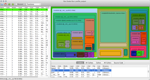
and you should now be able to get a nice visualisation of how much time each function consumes. It looks like this:

Screen Shot 2015-02-26 at 15.41.52

In the left hand side panel you can sort the functions by the execution time, the number of calls the combined time they took etc, while the right hand side panel shows the same information in a more human friendly format, i.e. in colour.

Line profiling

Run, snake, run is truly a fantastic tool and it gives you an idea of what eats the time and power pointing to the functions that may be optimised for a better performance. But, it also floods you with loads of the ‘inner guts of Python’ – functions inside functions inside functions hence finding out which bit of your code, i.e. the exact line, is the root of the problem is far from obvious. The line_profiler tool is great for that. There are some nice tutorial on how to use it here and here. To instal it try typing in the terminal:

$ sudo pip install line_profiler

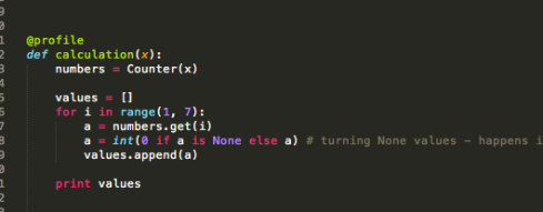
This should do the trick, if not download the files from here and try all possible installation routes described here. Once it’s installed, in order to use it add the  @profile decorator in front of the function you want to test, for example:

Screen Shot 2015-02-26 at 16.30.37

and run from the terminal:

$ kernprof.py -l -v script_name.py

The -l flag makes the decorator (@profile) works and the -v flag is used to display the time when the script is finished.

If it doesn’t work make sure that you have the  kernprof.py in the same folder as the script you want to run (it’s in the line_profiler folder, you’ve downloaded earlier), or provide the full path to where it lives in your computer, for example:

$ /line_profiler-1.0/kernprof.py -l -v script_name.py

The output is pure joy and simplicity, and looks something like this:

Screen Shot 2015-02-26 at 16.35.03

Now, we’re talking. It clearly shows that in case of my script almost 60% of the time is spent on line 20 where I count how often each number appears in my list. If you need someone to spell out how to read the output, head to this tutorial.

If you want to go further, check out this tutorial on profiling how much memory the program uses and checking if none of it is leaking. Or get on with it and switch to working on speeding up the slow bits of your code. The next tutorial will give you a few hints on how to achieve it.

Top image source: Alan Cleaver on Flickr flickr.com/photos/alancleaver/2661425133/in/album-72157606825074174/

Creating Gorgeous Graphics in R

You’ve made an amazing simulation. You’ve double and triple checked to ensure that the output you’re seeing is not something you’ve entrained in the simulation. You have emergence, and you want to show it.

Instead of doing tons of ugly screenshots, you want to make flashy graphics that will quickly and easily display your data. And suddenly you’re hit with the reality: you have to learn another computer language.

This tutorial is meant to show you how to make gorgeous graphics in R. This is the first in a multipart series I’ll be writing about graphing in R.

Please note: it is recommended that instead of copying and pasting what I’ve written below into your console, that you type it directly into R, because there are problems with font compatibility between this blog’s font and the font required by R. Mainly, the quotes don’t translate well between this blog and R, so you may get errors. To note, every instance of an apostrophe or quote may be rendered incorrectly and will thus be read incorrectly by the programming language R. Besides, it’s good practice to type it all, right?

First, if you haven’t done it already, download R. Once it’s downloaded you will see in your applications you have two versions of R: regular, and R64. R64 is a bigger, more powerful beast, and is good for scads of data. Thus, I always make sure that R64 is used (set it as your default).

(For info, I work on a Mac, so there may be tiny differences in how things run. For example, to execute the code in Mac I use command+enter. It’s slightly different for PC.)

Once R64 is open, click File -> New Document. Here you are going to create your R script. Save this (currently blank) file and give it a name that makes sense to you.

Good data tracking

I usually create a new folder for each of my projects, that way all of the data and graphs that are created (junk graphs and good graphs) are in a central location. However, I have one folder where I keep all of my R scripts, which I name descriptive things with dates (Mongolia_Graphics_Oct_2014.R).

Alright, once you create your file, let’s start coding!

The “R Console” is where your code executes. You can type things there, and if you hit command+enter it will run. However, if you want to save your script you want to write it in the new file you created.
But, to start, let’s write something in the console. Type this:


getwd()


And you hit execute (command+enter). That tells you which working directory you are working from, a.k.a. this is where your files will be read from, and where you will write files.

Open your file and type your first line of code:


setwd(“/Users/stefani”)


You can see that this looks similar to the above, but between the parenthesis you are telling the computer what to do. Here you’re telling it to set the working directory as “stefani,” which happens to be my working directory. I suggest you use your own name. If you retype getwd() that will show you what you set your working directory to.

Libraries
R is basically a shell within which you can dock different programs. These programs are called “libraries” and are stored in a central location.

Let’s install the library, “lattice.” It’s simple

Type this in your window:


install.packages(“lattice”)


You’ll see it crunching about, and finally it will finish. Now if we want to make sure it’s loaded, type this:


library(lattice)


Okay, now please find and load the following:


library(lattice)

library(latticeExtra)

library(Hmisc)

library(RColorBrewer)

library(plotrix)


For this tutorial we are going to work with some dummy-data that I output from a simple simulation so we can make some population graphs. First, please download the dummy data here (upper right hand corner, click “download csv”): https://www.academia.edu/9049652/Dummy_Data_for_Tutorial

Okay, let’s make some graphs!

First, we need to load the data. It’s a simple command.

And then put that in your working directory.

To read data, do this:


read.csv(“data.csv”)


But of course we want to assign that a name, so:


data<-read.csv(“data.csv”, header=T)


(we are reading the csv file we have and assigning it to the local variable “data”. Header=T means there are names for the variables, so we want to respect that and not assign the first column as data points).

Now run this next command:


data[1:5,]


And that will show you the first five lines of your data. That shows you all the variables: ticks, agentsA, agentsB, agentsC, agentsD, numberAgents, seed, patchVariability, energyFromFood, energyRegrowthTime, energyLossFromDeadPatches

Okay, first, we note that everything to the right of “numberAgents” is static, so those are parameters that were not changed for this tutorial. But we notice that the first six variables do change. Ticks, that’s the time, so we know we’ll want that on the y axis. The other five are the counts of different types of agents. numberAgents appears to be a sum of agentsA-D, so first let’s make a graph of ticks versus numberAgents.

Try this:


plot(numberAgents~ticks, data=data)


That would read that we’re plotting the # of agents (on the x axis) by the number of ticks. The data we’re using is the variable we assigned above, which is “data”.

Screen Shot 2014-11-02 at 10.22.01 AM

Well, my goodness, isn’t that ugly? But it shows a basic trajectory of what we’ve got. There’s a circle for each of the data points (numberAgents), and it’s versus the number of ticks. We can add something very minor:


plot(numberAgents~ticks, data=data, type=”l”)


That takes the circles and makes them into a line. “Type” here means “what type of data are we plotting?” L=lines, p=points. If you want more information type:


?type


And that gives you the help menu for R

If we add more things to our string there, we can change how thick the line is and what color.


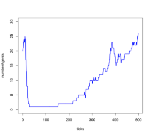
plot(numberAgents~ticks, data=data, type=”l”, lwd=2, col=’blue’, ylim=c(0,30))

Screen Shot 2014-11-02 at 10.24.42 AM


Here we changed the color of the line (col), the thickness (lwd), and the scale (ylim means the y axis goes between 0 and 30).

Let’s say we want to save this graph? What do we do? Take a screenshot? NO! We do this:


pdf(file=”PopulationsAllAgents.pdf”, width=5.44, height = 3.5, bg=”white”, paper=”special”, family=”Helvetica”, pointsize=8)

par(mar=c(4.1,4.5,0.5,1.2))

par(oma=c(0,0,0,0))

plot(numberAgents~ticks, data=data, type=”l”, lwd=1, col=’blue’, ylim=c(0,30))

box()

dev.off()


We are creating a pdf file, giving it the size, type of font we’re using, etc. You can see that our command to plot the line is exactly the same as before. We’re putting a border around our graph. dev.off() is the command to say “we are done creating our pdf graph”.

If you run this you can check your working directory (as you set above) and you should see a graph named PopulationsAllAgents

Now let’s add the other agents to this graph!


pdf(file=”PopulationsAllAgents.pdf”, width=5.44, height = 3.5, bg=”white”, paper=”special”, family=”Helvetica”, pointsize=8)

par(mar=c(4.1,4.5,0.5,1.2))

par(oma=c(0,0,0,0))

plot(numberAgents~ticks, data=data, type=”l”, lwd=1, col=’blue’, ylim=c(0,30))

lines (agentsA~ticks, data=data, type=”l”, lwd=1, col=’red’, ylab=FALSE, xlab=FALSE)

lines (agentsB~ticks, data=data, type=”l”, lwd=1, col=’violet’, ylab=FALSE, xlab=FALSE)

lines (agentsC~ticks, data=data, type=”l”, lwd=1, col=’orange’, ylab=FALSE, xlab=FALSE)

lines (agentsD~ticks, data=data, type=”l”, lwd=1, col=’green’, ylab=FALSE, xlab=FALSE)

box()

dev.off()

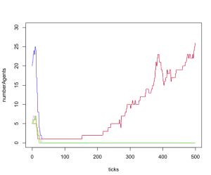
Screen Shot 2014-11-02 at 10.26.08 AM


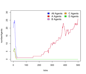
You should see five lines in blue, red, purple, orange and green. Note that when you start a plot you use the command “plot” and if you add more stuff to it you use other commands. Here we used the command “lines” but you can also use other commands such as “points.” If you wanted to only show the individual strategies you would skip the first line.

Okay, now let’s add a legend to our code. Let’s put it in the upper right hand corner, and use two columns. (topright can be exchanged for other placements. See here: http://stat.ethz.ch/R-manual/R-patched/library/graphics/html/legend.html )


legend(“topright”, legend=c(“All Agents”, “A Agents”, ” B Agents”, “C Agents”, “D Agents”), bty=”n”, fill = c(‘blue’, ‘red’, ‘violet’, ‘orange’, ‘green’),cex=1.1,ncol=2)


Here’s the full code:


pdf(file=”PopulationsAllAgents.pdf”, width=5.44, height = 3.5, bg=”white”, paper=”special”, family=”Helvetica”, pointsize=8)

par(mar=c(4.1,4.5,0.5,1.2))

par(oma=c(0,0,0,0))

plot(numberAgents~ticks, data=data, type=”l”, lwd=1, col=’blue’, ylim=c(0,30))

lines (agentsA~ticks, data=data, type=”l”, lwd=1, col=’red’, ylab=FALSE, xlab=FALSE)

lines (agentsB~ticks, data=data, type=”l”, lwd=1, col=’violet’, ylab=FALSE, xlab=FALSE)

lines (agentsC~ticks, data=data, type=”l”, lwd=1, col=’orange’, ylab=FALSE, xlab=FALSE)

lines (agentsD~ticks, data=data, type=”l”, lwd=1, col=’green’, ylab=FALSE, xlab=FALSE)

box()

legend(“topright”, legend=c(“All Agents”, “A Agents”, ” B Agents”, “C Agents”, “D Agents”), bty=”n”, fill = c(‘blue’, ‘red’, ‘violet’, ‘orange’, ‘green’),cex=1.1,ncol=2)

dev.off()

Screen Shot 2014-11-02 at 10.27.40 AM


Let’s inspect the graph. If you look, you can see that the red and blue lines go on top of each other. Hmmm. And the red line ends up being on top. That’s because things happen in the order you write them. Since we put the red line second, it draws on top. Maybe we want to be able to show different types of lines. The command for line types is lty. You can see what they look like here:

http://www.statmethods.net/advgraphs/parameters.html

Play around with changing lty and the lwd (line width) until you get the graph you want.

If you don’t like the labels, set ylab and xlab to false on the first plot command. Also, if you want a different type of output, change it from pdf to png or whichever.

You’ve made a spanking new population graph!

Want more R code? I have a bunch in the appendixes of my M.A. thesis, which is archived here:

https://www.academia.edu/1526170/Why_Can_t_We_Be_Friends_Exchange_Alliances_and_Aggregation_on_the_Colorado_Plateau_Crabtree_M.A._Thesis_2012

Extra special thanks to Kyle Bocinsky, who taught me all I know about making graphics in R, and whose scripts inspired this post.

The next post in this series, “How to handle big data” will examine what to do when you have data from thousands of runs of simulations.